Categories
Uncategorized

Take care of who take care us

To be a healthcare professional is already so complicated to have a complicated system to deal with.

With that in mind, we started to think about the new format of what has now been elected the best electronic medical record in Latin America for four consecutive times according to the North American research and insights institute, KLAS.

We want to turn a lot of information to people who save lives in a lot of organized information.

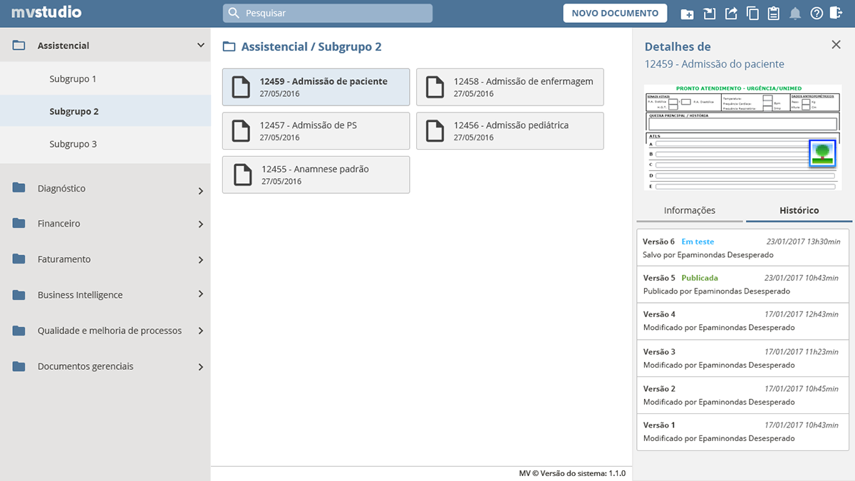
If you’ve ever seen an electronic medical record, you know how much information is there and how vital it is.

This is the previous main screen and we knew that we need to do it better


We had a mission to gather a series of information that was spread on paper and in different systems and bring it to a single system, where each professional profile – doctors, nurses, nutritionists, physiotherapists, among others – could prioritize exactly what they needed without hurting patients’ privacy rights.

Main patient’s dashboard

There were a number of issues that were taken into account when carrying out the research with users, such as, for example, the sensitivity for sharing patient data and having a design team in a place as sensitive as an operating room.
There was also a technological barrier to be overcome as the dev team had been working with Adobe Flex, a technology that was about to stop being supported by the main market browsers.

Drag to compare version Adobe Flex with the version HTML designed

In addition, it was necessary to overcome some conflicts between the information that hospitals and health plans needed and what doctors were willing to do, since some necessary validations could slow down the process of caring for people.
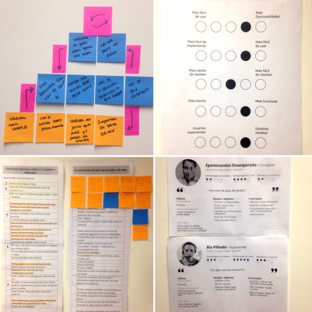
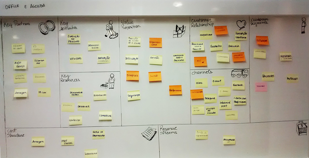
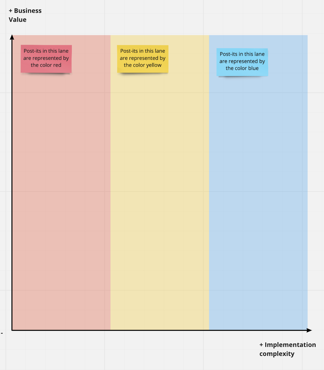
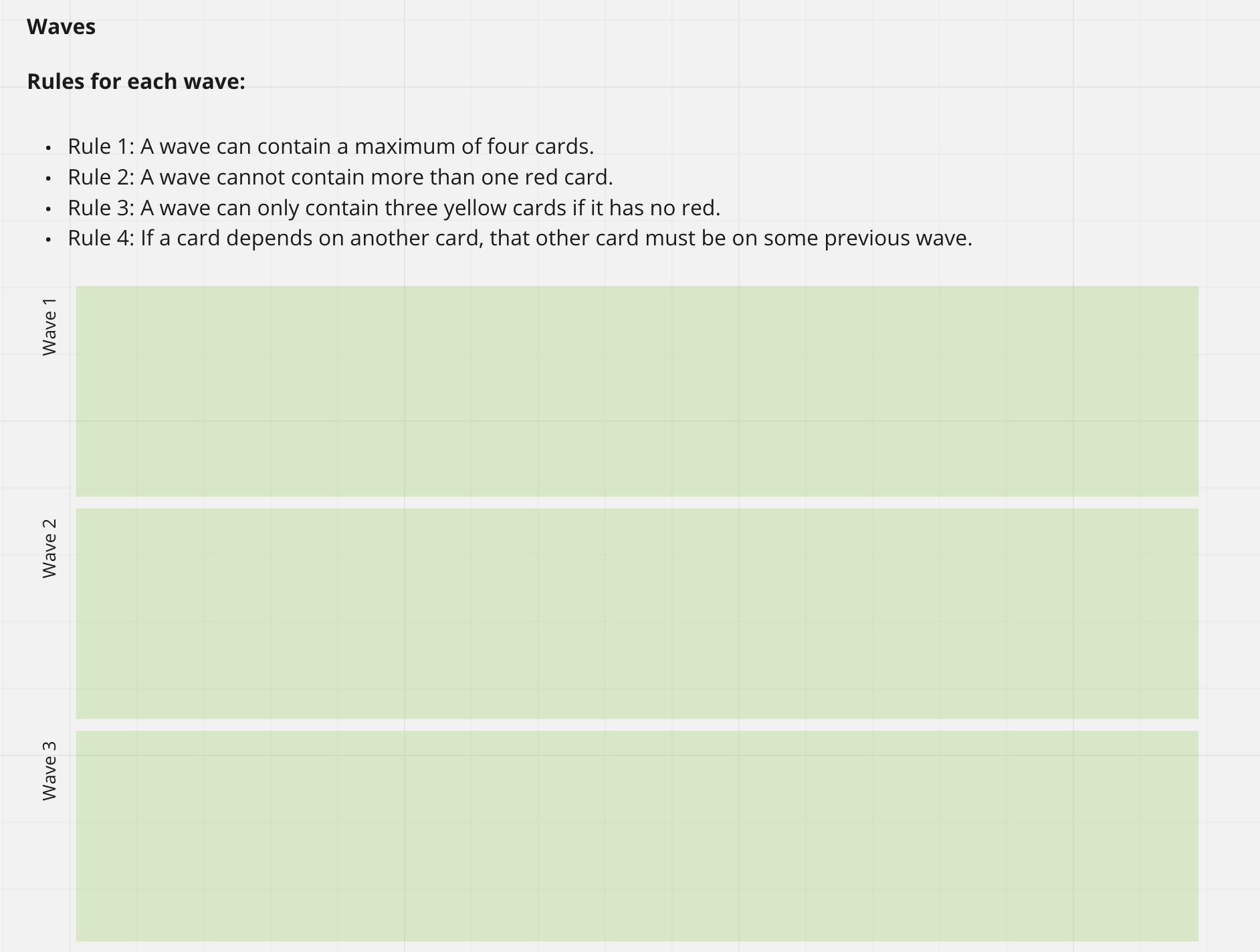
After many interview sessions, a series of processes for co-creating, prototyping and validating the solution made it possible to deliver a first phase of the product.
It was hard work that I am proud to have been a part of.

Categories
Uncategorized

A form builder for healthcare people

I, Daniela Falcone and a multidisciplinary team past for many design steps to create a What You See Is What You Get form builder designed for doctors and nurses with restricted computer skills to create their own care protocols.

To understand

The project started due to the many complaints the support team received and usually ended up with the dev team making workarounds to fix bugs and deliver what the user wanted (but not exactly needed). Of course this approach delivered an app full of misused tools, bugs, performance glitchs, and a lot of trouble to the support team.
So, we sat down with all of them (devs and support) to hear why they made the decisions they did when creating the current tool.
We started analyzing an always-increasing-never-implemented requirements list. To understand it, we mapped the 4 different user profiles (proto-personas) and then talked to them and listened the different perspectives of the platform problems and priorities. With that, we made a priority list and the use flows of each case (current, new or both), as well as a priority focus for the design project, which focused on novice users but valued features over easiness of use.

Some artifacts generated on research and ideation phases: flows, personas, support to decision matrix and insights for research.
Some artifacts generated on research and ideation phases
The main form builder interface design by me and Daniela
Form builder interface
Document explorer window created by me and Daniela
Document Explorer
New Document Window
New Document Window
The boolean builder interface in detail, designed by me and Daniela.
The boolean builder

In this project we had opportunity for to do research, co-crearion workshops, prototype process and validation with user, besides to keep support to dev team as long it was in development process. Today the Studio form builder is an important part of a portfolio of products from a multinational company that produces healthcare software and ins in production in some hospitals on Latin America.

Categories
Uncategorized

A validation process

The validation stage in the projects I work on is an important stage. In this case (which is anonymized due to NDA issues), we had a short deadline for delivering an MVP and a design testing stage had been disregarded by the sponsor. Even so, we had great results when including the end users before delivering the project of a mobile solution to evaluate the attendance of a technical service.
We had planned a five-level satisfaction scale based on Likert, where the closer to 5 the more satisfied the end customer would be with the service.

A mobile interface showing a satisfaction quiz with numbers from 1 to 5 with different colores for each item.
This is our the first idea about the interface.

We were not sure whether using a color scale would help or not in making the user’s decision about which option he would choose, so we recruited some people who were within the solution’s user profile and, in pairs, we asked them to perform a task.
We found that, not only did colors not help in decision making, but they hinder users. We also found that they felt more comfortable using letters (they felt it was more neutral and less influenced) than using the numbers from 1 to 5. So, we changed the interface and the end result has been well accepted.

A new version of previous image where all options have the same blue color and change numbers from 1 to 5 for letters from A to E.
After validation with users, we used a version where all options have the same color and change numbers from 1 to 5 for letters from A to E.

We did the test with approximated ten users and we make sure that we had at least one color blind person in the group, after all, the test included color issues.

I wrote and publish about this process in the portuguese page of uxdesign.cc too.

Categories
Uncategorized

A mobile system for when you need it most

Think about this. You go to a hospital with a huge migraine. All you want is to be taken care of and let that pain leave you alone. But instead, you have to give a lot of information about where do tou live, you health insurance number e things like that. Sometimes you need to wait for you insurance to allow before you to be assisted. It’s this situation which we need to work to get better.

We start with a process of getting to know the users, working with them to provide a solution that everyone can use. With the team I did a cycle of user research and from the collected data the insights were categorized, becoming user stories.

Insights categorized
A business plan drew on witheboard.
First version of business plan

After facilite a creation of a business plan with the product and business team, the MVP version was defined, prototyped in low and high fidelity version and validated. UI assets was generated by Adobe CC and made available for dev team by Zeplin. As long the team as developing the first version, I made support for dev team and work been designing on next versions.

Today the system are in a production version in some private hospitals on Latin America.

Categories
Uncategorized

A remote prioritization of product backlog

During the COVID pandemic, the best way to help a customer in another state in the country to prioritize their backlog was to do this remotely. I had the opportunity to facilitate a series of workshops and the result is that it became much easier to define the releases of a product and to have an idea of its roadmap.

The customer needed general visibility into what was expected to be implemented and the development team needed more clarity on where the product was heading. This started with the setting up of an environment in Miro that would be used to have a picture of the current situation and define our next steps.

At first we’ve done a a review of all user stories wrote for the previous product owner and put each story in a Miro post-it and schedule a 4 hours workshop.

As a team we start the workshop defining what is the vision of the product for short, medium e long term.

Three post-its on the Miro board, one blue, one purple and one orange to define short, medium and long term goals

After that, keep an eye on this goals the team start to put the stories in a matrix, where product and business teal define y axis for priority and dev define x axis for complexity:

At last, we transport the post-its with the stories for the waves. according to rules:

  • Rule 1: A wave can contain a maximum of four cards.
  • Rule 2: A wave cannot contain more than one red card.
  • Rule 3: A wave can only contain three yellow cards if it has no red.
  • Rule 4: If a card depends on another card, that other card must be on some previous wave.
An image that explains the rules to prioritize user stories in waves
The rules of the waves
The waves board on Miro on green rectangles representing waves.
The waves board on Miro

With the waves fulfilled all the team had a vision for the sprints, what is the priority for the stories and we knew if and what are the stories need to be broken or need more details.

Every week we back to the waves and evaluate what is need to change and it maintain all team looking for the same perspective.

I wrote and publish about this process in the portuguese page of uxdesign.cc.

Categories
Uncategorized

Helping to low energy lost

I was part of a team of designers who helped a subsidiary of a large multinational in the energy area to reduce their losses by more than 20%. The project lasted about three months and have stages of immersion research, desk research, co-creation based on Design Sprint method, prototyping and solution validation. After this project, the customer contracted a series of innovation by design projects with CESAR. But how did it all happen? Let’s do it by steps.

At first we went to know closer the problem. How people dealt with it. And, as always is crystal clear when you do research, the problem was different that we had imagined.

A person work in a computer with 2 screens. A window and the view of the street in background.
I was there taking this photo while this person showed her work process to recover electric energy

So we selected two challenges on process for recover electric energy for work in Design Sprints. Our team had 4 designers and we recruited employees of the company for take part in two intense weeks.

Some sketches in a grey wall.
Some sketches generated by the team along one of Design Sprints

We performed mapping, sketching, decision, prototype and validation steps in each sprint and this helped us to propose changes in the processing flow of cases of lost energy.

For NDA issues is not possible share prototypes generated on Axure RP and Adobe XD that will support the changes on proccess of the energy company.

I described a little bit of this process, in portuguese, in a CESAR Medium publication.